10 PANTONE SHADES, 10 DESIGNS; YOUR VERDICT!

There's something undeniably electrifying about infusing a room with vibrant bursts of color that ignites my creative spark! If you had told me a decade ago that I'd develop a passion for bold hues, I would've probably chuckled. Yet, my once-neutral abode would have been a testament to that sentiment.
Fast forward ten years, and I find myself utterly enamored not just with colour, but also with fabrics, textiles, and the art of mood-setting decor. This post is a testament to that passion: a curated collection of ten rooms, each boasting its own unique style, personality, and colour palette.
Here's the fun part: I enlisted your help over on my Instagram stories to vote for your favorite look. And guess what? I've committed to recreating the winning design using the same colour palette and interior style—all without breaking the bank, with a budget of under £800! Exciting, right?
Now, let's reminisce about the stunning colours and designs that graced my Insta stories. The winning design will be brought to life in my next blog post, so stay tuned for the grand reveal! 🌈✨
1. FEELING BLUE? DEFINITELY POSSIBLE WITH PANTONE'S BABY BLUE SHADE

I must say, baby blue isn't a colour I'd consider decorating my personal space with. But seeing it in action here with the contrasting shade of blue (Winter sky to be precise) on the Butterbump chair by Loaf could easily persuade me.
Your verdict: 40 votes
2. WALLS SO LOUD; EVERYBODY LISTENING! PANTONE SHADE; CHERRY TOMATO
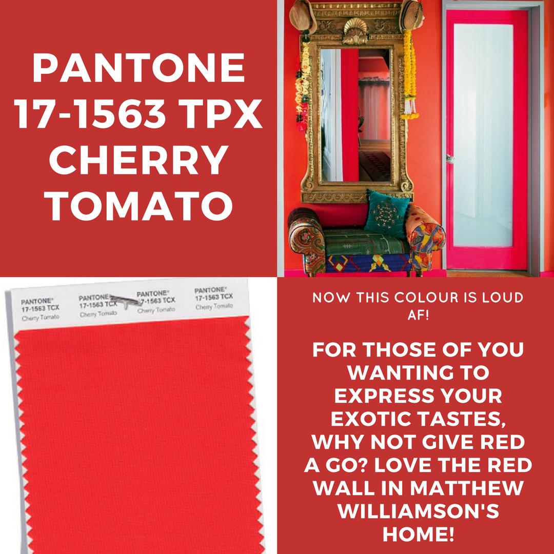

Now, y'all know I love pretty much every colour on the wheel; regardless of contrast, brightness, shade, or anything. I was particularly drawn to this vibrant capture of Matthew Williamson's electric living room, because I just love the way it incorporates culture, rich textiles and 'meaningful memorabilia'.
You can read more about Matthew's home here.
Your verdict: 40 of you said this room was way too loud for you.
3. KALE, ANYONE? LET'S GET TROPICAL USING PANTONE SHADE KALE.


Image via Pinterest
Possibly one of my personal favourite designs because I am just tropic crazy and would have a million plants in my house if the dogs wouldn't pee all over 'em...*sigh*.
I've featured the shade KALE here, which is a similar tone to that gorgeous sofa.
Your verdict: 40 of you said YASSS to this style
4. I'M JUST MAD ABOUT SAFFRON! & SAFFRON'S MAD ABOUT ME.


Image via Pinterest
Now I know what some of you are thinking... this is a biased choice; yadda yadda yadda. Yes, obviously I love anything with a name (almost) the same as mine. But you should also know that I've been a fan of yellow tones since I saw my mum completing WERKIN' a mustard coloured jumper to work (which must have been over 10 years ago too- what is it with the number 10 these days). You'll also know that Saffron is my goto colour for spring 18.
But what did you guys think?
Your verdict: 31 of you said you liked this interior style.
5. SAY HELLO TO PANTONE'S BOUJEE BLUE AKA NAVY BLUE SHADE!
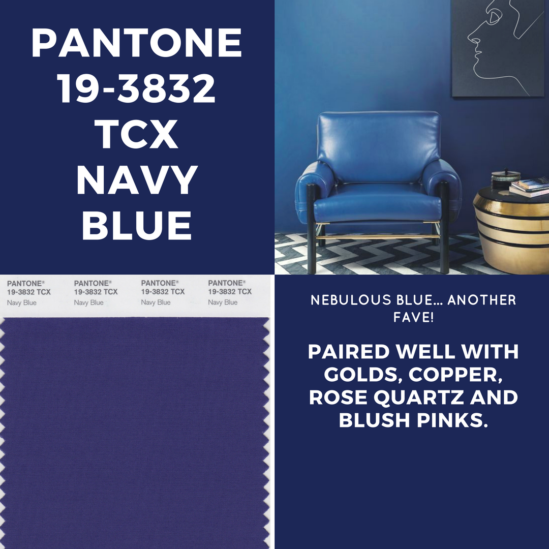

Image via Pinterest
Another top pick of mine is this gorgeous navy blue set up, with complementary gold accents and that wonderful geometric floor. I'd recently considered similar shades when making plans for my bathroom makeover, but decided not to press ahead. Did I make the wrong decision? Who knows... find out next time on MIND YOUR DAMN BUSINESS. (Just kidding- it just sounded so right...I also said that in my best friends voice LOL).
So what did you guys make of this little setup?
38 of you said you'd have this decor in your home.
6. ROSE QUARTZ SHOWER GOALS!
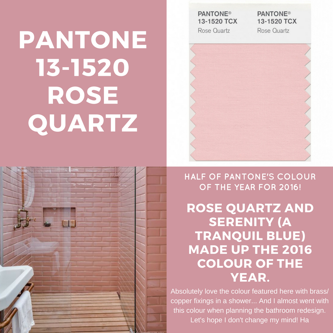

Image via Historias de Casa
Firstly, I think it's important that I share with you the fact that my dream home WILL incorporate some form of open shower. I can literally imagine myself showering in summer, spring, and the pouring rain...so much so that I am actually considering practicing for my open shower during my next shower. OK, totes off topic.
Anyway, how gorge is this rose x copper shower? I asked you guys if you could imagine showering here...
and 46 of you said YASSSSSS! Me too!
7. STATEMENT WALLS WITH PANTONE SHADE TEABERRY


Image via Pinterest
More vibrant rich textiles from the inside of Matthew Williamson's home. I absolutely love electric shades such as hot pink, but only when it's used right as it also has a knack for reminding me of my bedroom as a teenager (which isn't necessarily a bad thing, but definitely not what I'd be going for at the age of 27).
Matthew has integrated patterned textiles and antique gold accents to achieve this look. I asked you all what you thought of his decorative taste...
36 of you said ISSA YES from you.
8. ALL THE GRAYS WITH PANTONE SHADE VAPOROUS GRAY


Image via Pinterest
Another fave of mine; combining soft grey tones with bright gold accessories. If you've seen my living room you'll notice that it very much follows a similar scheme (bar those dreadful cushions- soz). I'm also a huge fan of statement furniture and the gold glass table in the back makes the perfect accent to the gold feature mirrors on the mantle.
Your thoughts?
47 of you loved this design.
Ohhhh we are down to the last two... and almost onto the winner! But before I reveal your chosen look and the design that I will be recreating using handpicked products in my next blog post, let's have a look at the runner up.
9. PANTONE SHADE OF THE YEAR 2018: ULTRA VIOLET

Image via Pinterest

Look at that; you guys LOVED the ultra violet decor displayed in the dining room image above. Although I'm not a huge fan of this shade myself, I can definitely see why many of you are fond of it, and is still a great way of incorporating colour into a home where dark decor schemes are preferred.
Ultraviolet is also the PANTONE colour of the year. So, how many of you loved it?
37 of you thought that this colour shade/ design is perfect.
And finally, the winning design with 89 votes that we're crowning the Saphron London favourite of the month is...
10. LUXURY INTERIORS IN PANTONE SHADE HAZELNUT


Image via Pinterest
Oh, let me tell you, I'm swooning over the sheer luxury and zen vibes of this space! It's like stepping into a dreamland of elegance and tranquility. Not only are the neutral tones giving me all the feels, but those statement pieces? They're taking the whole vibe to a whole new level of chic.
I can't wait to roll up my sleeves and recreate this look! I mean, who wouldn't want to bring a slice of this opulence into their own home, right? Plus, I have a feeling I'll stumble upon some fab inspo for my own decorating adventures along the way.
Stay tuned as I embark on this style journey, and hey, if you missed out on voting in my insta-stories, no worries! Just drop me a line and let me know which colors and designs from above are tickling your fancy the most. Let's create some magic together! ✨